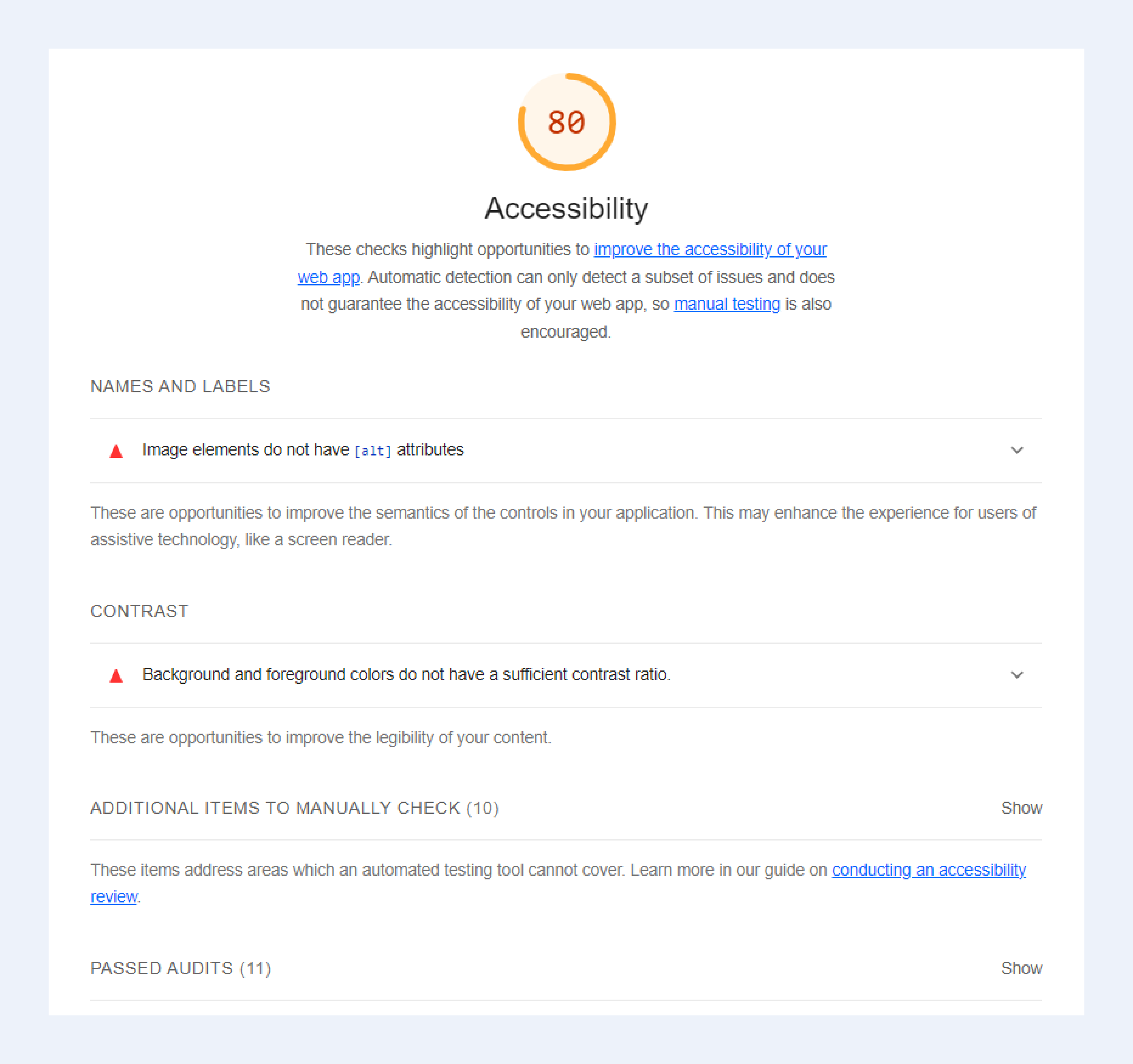
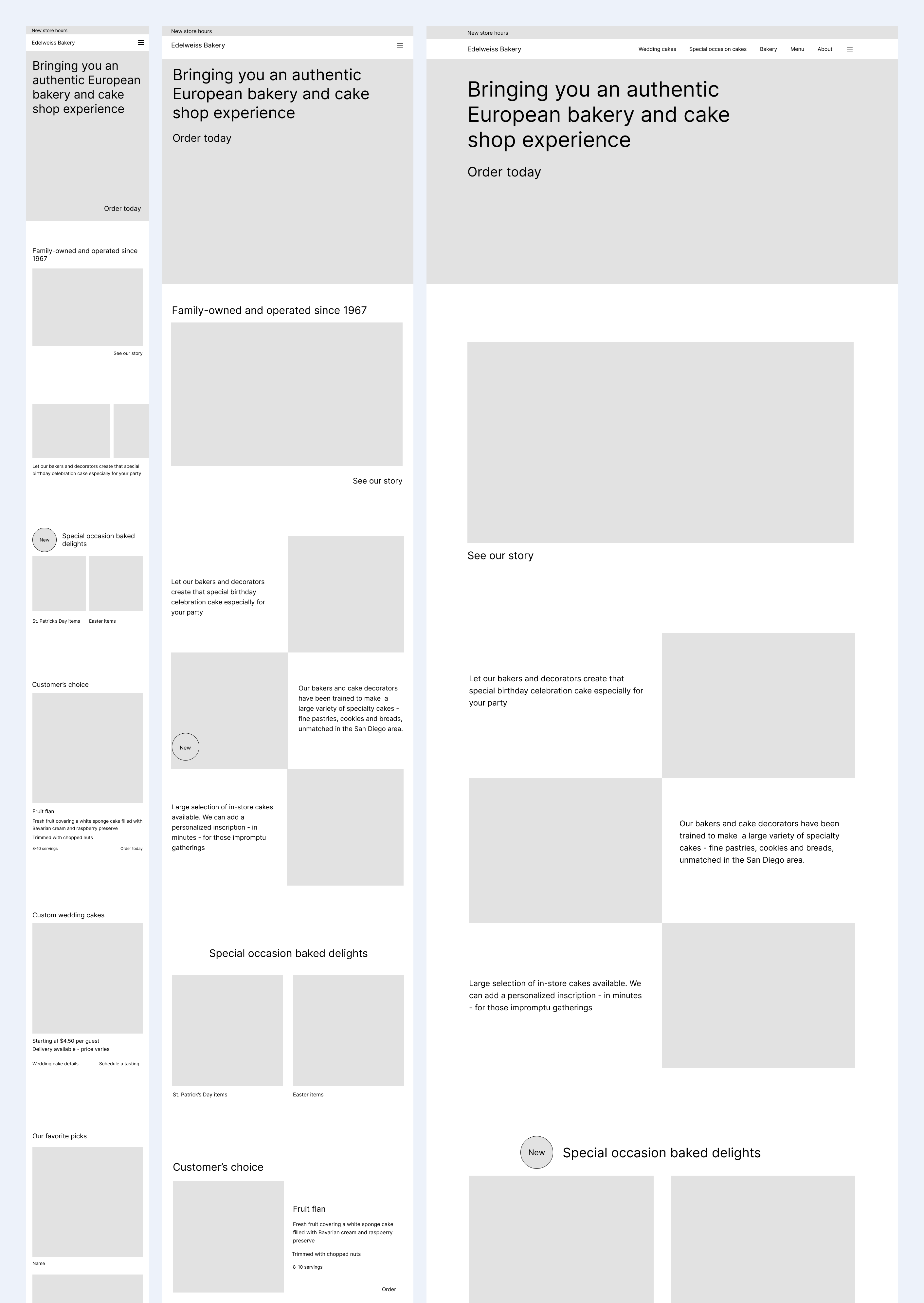
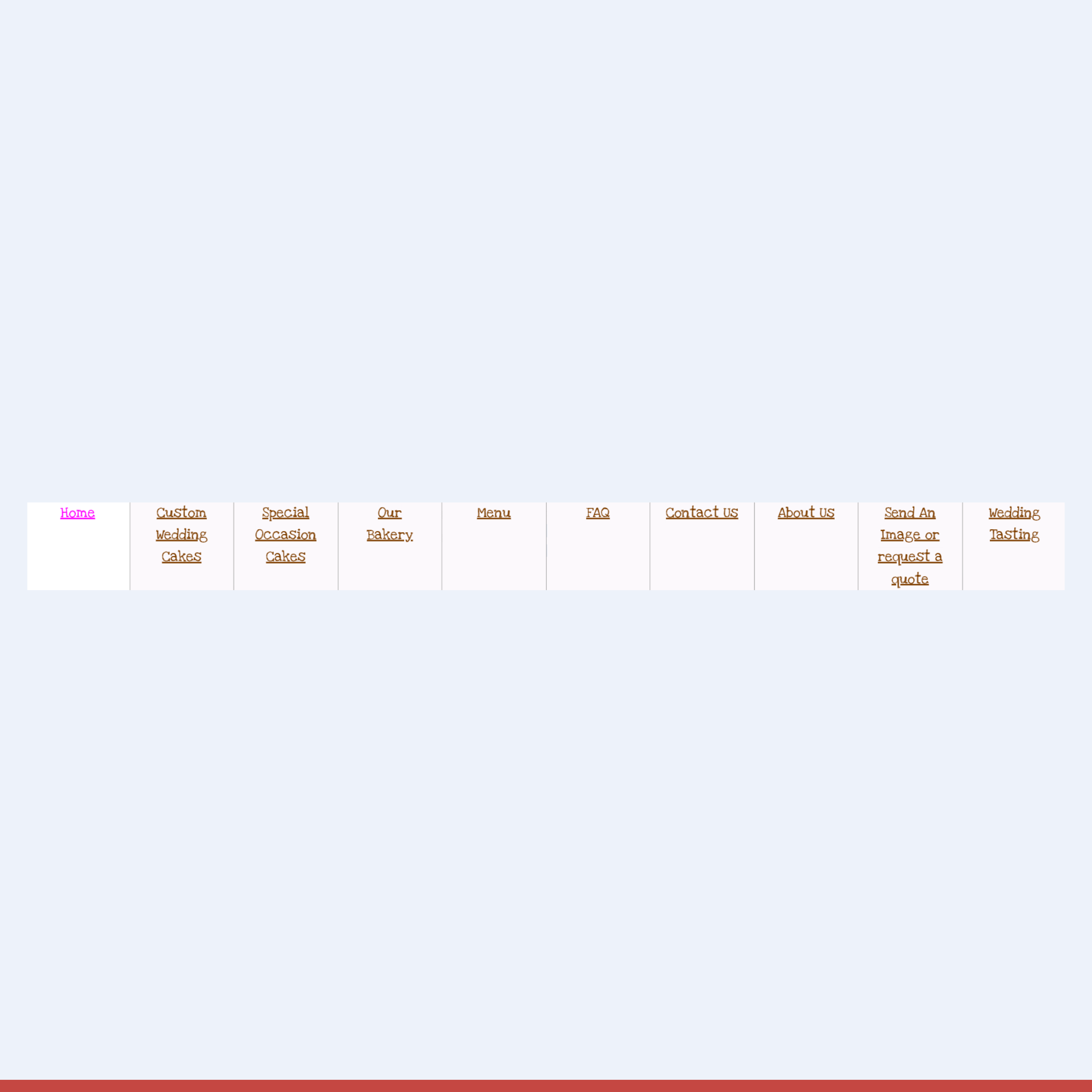
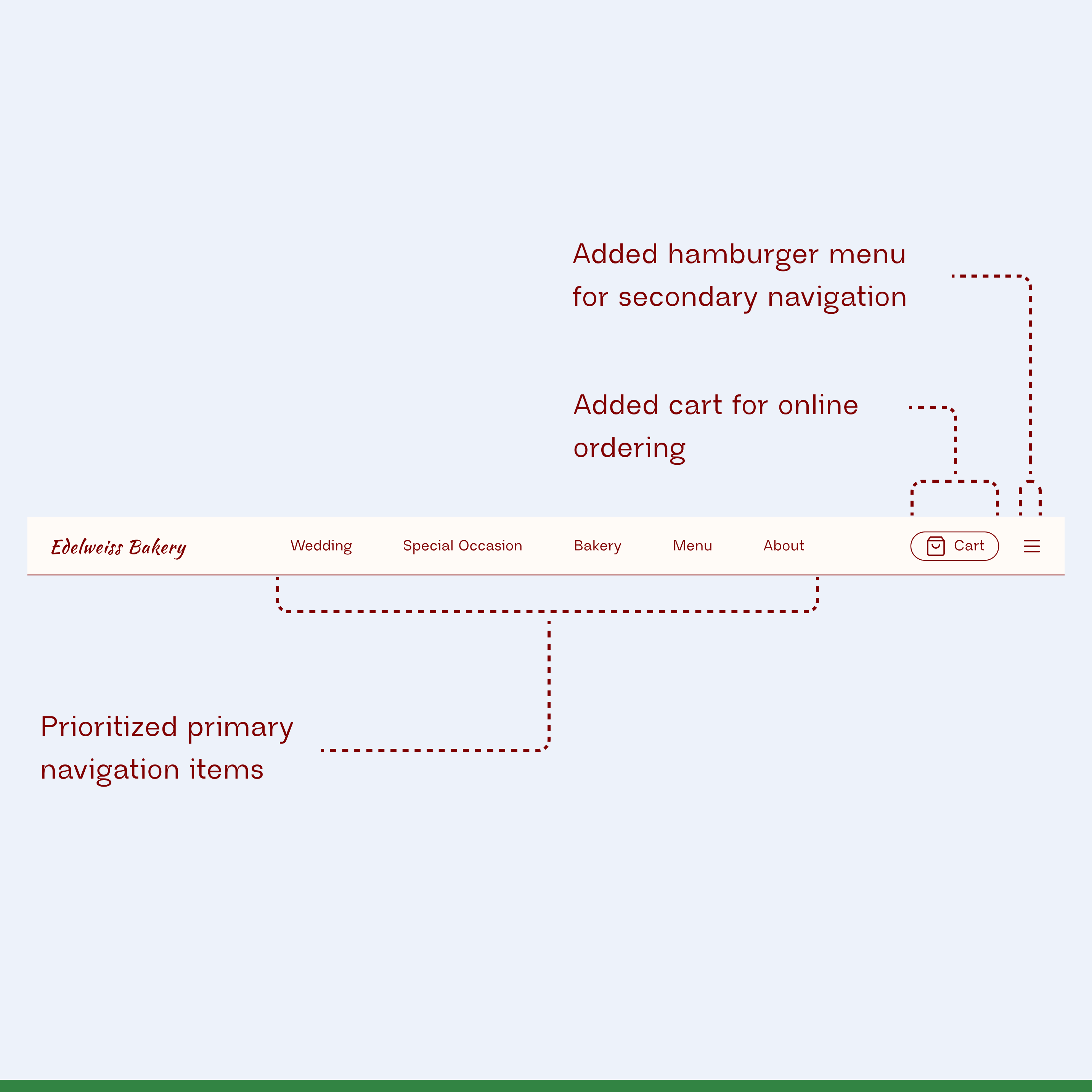
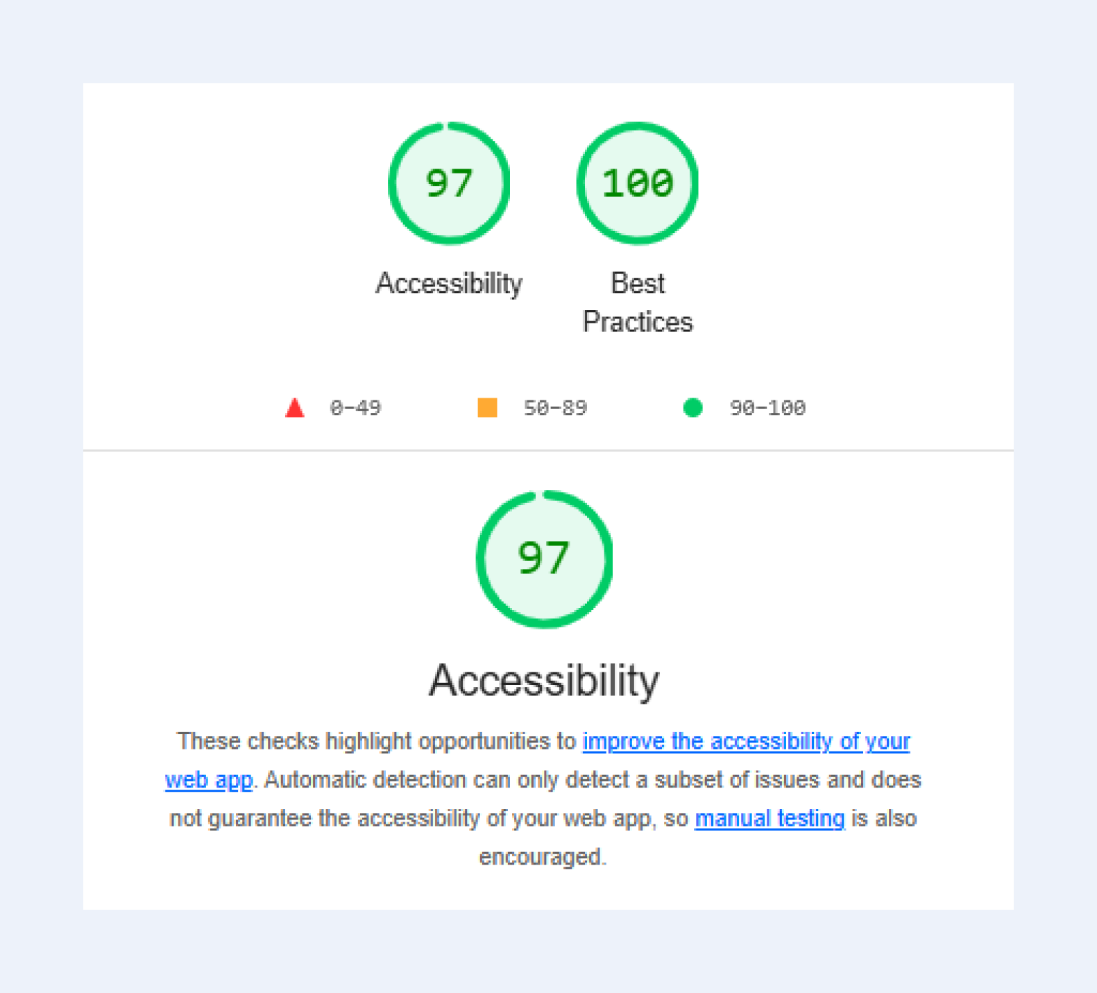
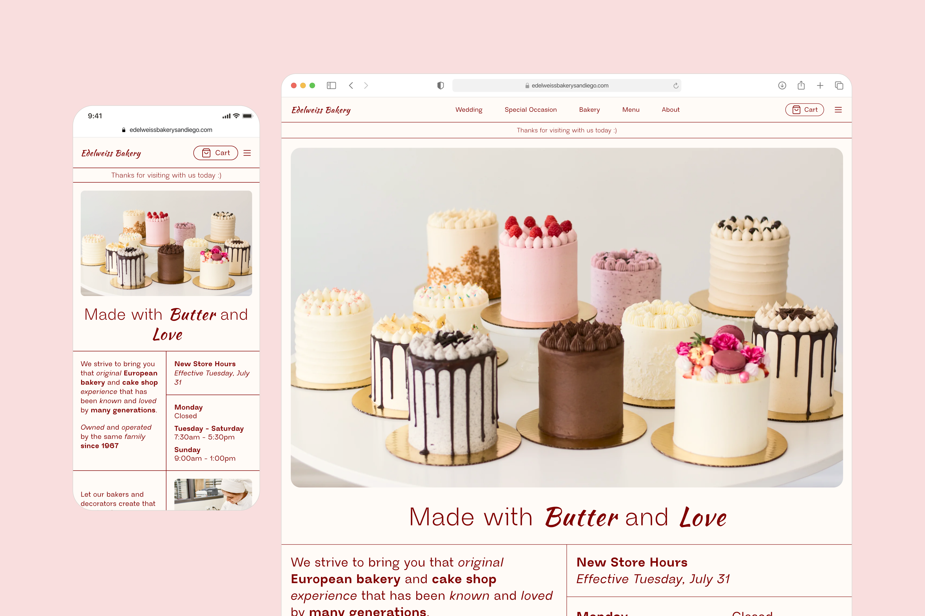
Redesigning a family-owned bakery's homepage to improve accessibility, enhance the user experience, and establish a cohesive brand identity for potential long-term growth.
ROLE
Designer/Developer
TIMELINE
Feb 2024–Mar 2024
3 weeks
TEAM
Individual
SKILLS
Web Design
Visual Design
TOOLS
HTML/CSS
Figma
CONTEXT
Edelweiss Bakery is my family’s go-to bakery for birthday cakes since childhood. After visiting their website for the first time, I saw many opportunities for improvement to better showcase the bakery’s story and specialties.
Inspired to enhance the interface and browsing experience, I redesigned and developed Edelweiss’s homepage.
SOLUTION
The new website features a clean, modern interface with a cohesive identity. With clear hover states and options to order online, the site moves beyond simply showcasing bakery items to offering a seamless, user-friendly shopping experience.
PROBLEM
OBJECTIVES
After evaluating the website from both a visual and usability standpoint, I used Chrome’s Lighthouse to perform an accessibility check.
This revealed issues that weren't immediately apparent, such as missing alt attributes for images and a lack of contrast in some areas.
Keeping these issues in mind, I identified key areas for improvement I wanted to focus on in my redesign:
Prioritize a responsive design that adapts seamlessly across devices, especially those on mobile.
Use consistent styling and focused navigation to highlight key information without distractions.
Limit and use legible fonts to enhance readability and unify the overall design.
Increase contrast in buttons and text and ensure all images include alt text.
PROCESS
The original website used a loose three-column structure that was not responsiveness.
It used a variety of fonts, button styles, and colors, which made it difficult to maintain a cohesive look. Additionally, the images were poorly lit and low-resolution.
I simplified the layout from 3→2 columns to improve readability and highlight the images. The redesign follows a structured grid system to enhance visual hierarchy.
I used dedicated sections to group Edelweiss’s signature cakes to ensure that each bakery item is presented in an organized and scannable manner.
I prioritized telling a cohesive story to guide users and build ethos to create a more engaging and visually coherent experience for visitors.
Before
The navigation was very cluttered with 10 items crammed into the menu, causing a lack of hierarchy. Many of these links felt secondary against the bakery’s main services.
After
I prioritized the most important navigation items and moved secondary options to a hamburger menu. I also added a cart button to highlight online ordering, a service not offered.
The style guide preserves some elements of the old website’s warm color palette and typography, using only 2 fonts instead of the original 7. I also simplified the UI by decreasing the number button styles from 5 to 2.
LEARNINGS
One of the biggest challenges was modernizing Edelweiss's web aesthetic while preserving the bakery's warm, family-owned charm. While the redesign is a significant departure from the original, I retained key colors and fonts to maintain that connection.
User testing would have been beneficial to ensure that the redesign felt consistent with the bakery's original vibe rather than creating a sense of two separate bakeries.
This was a great opportunity to enhance both my coding and UI design skills. I had so much fun working on this redesign!