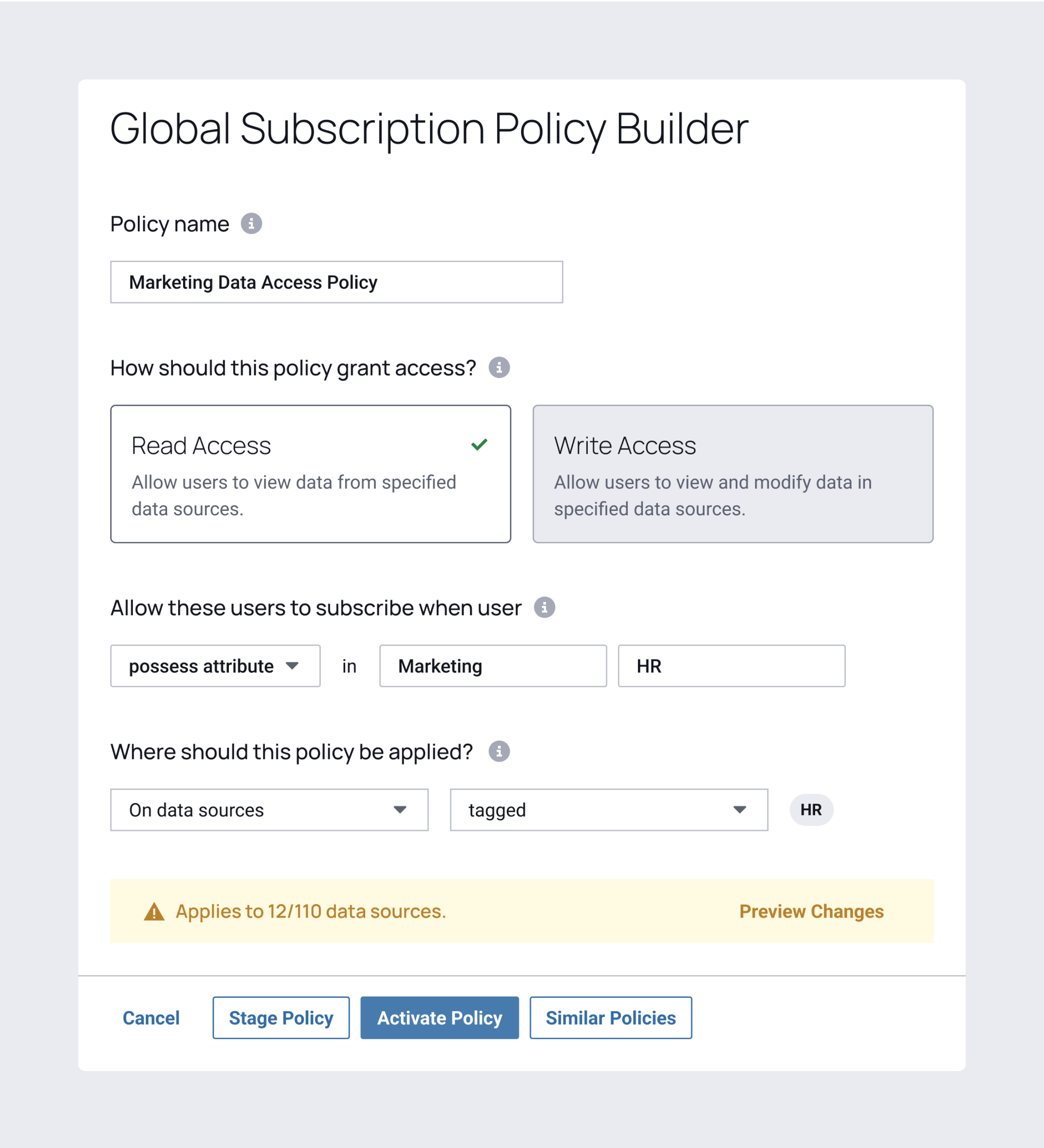
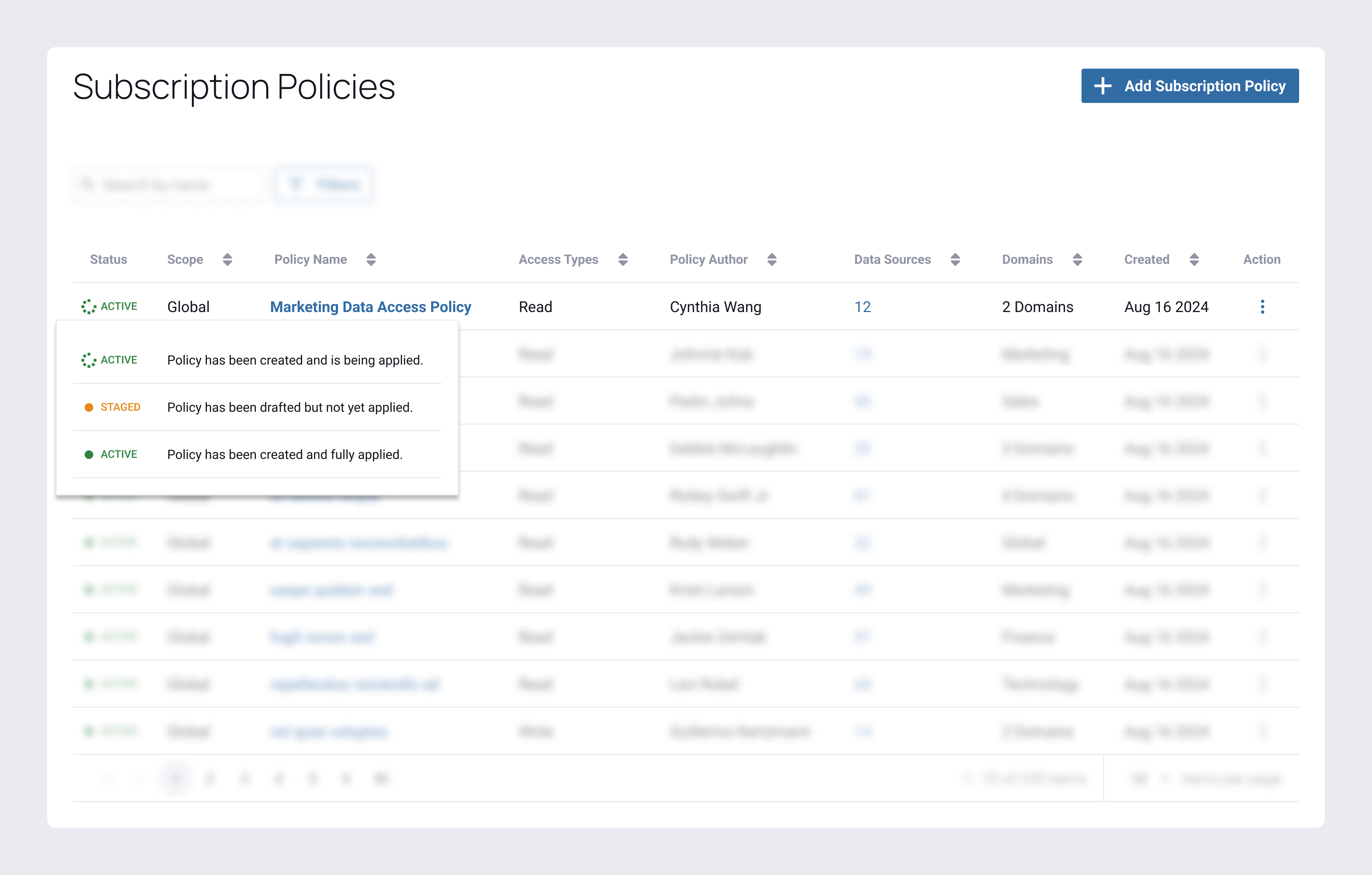
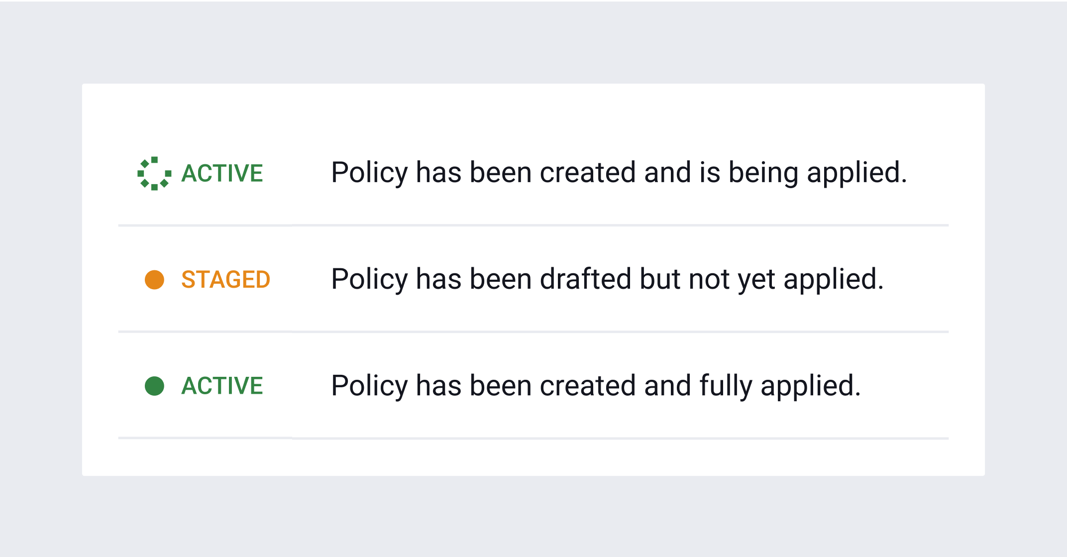
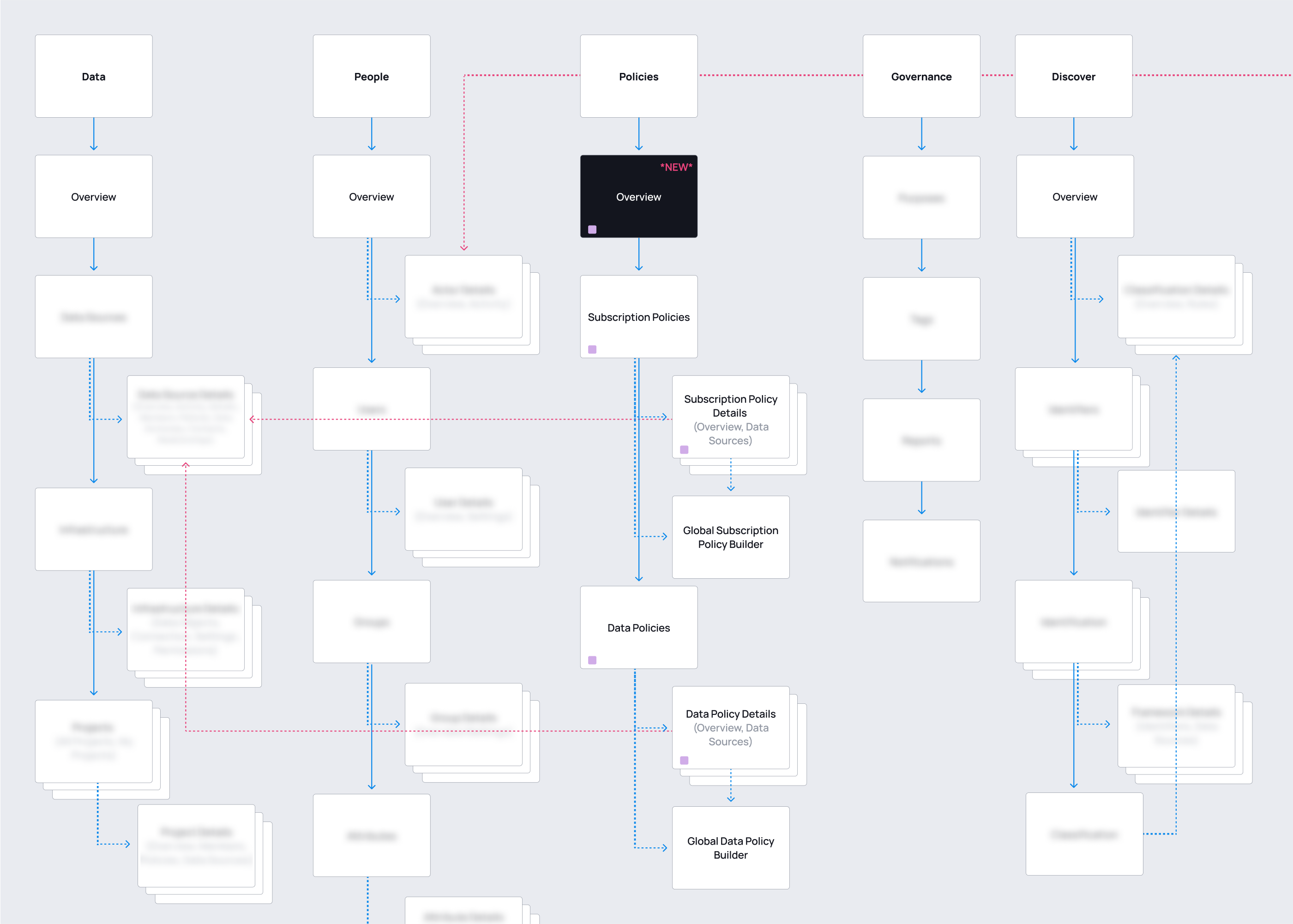
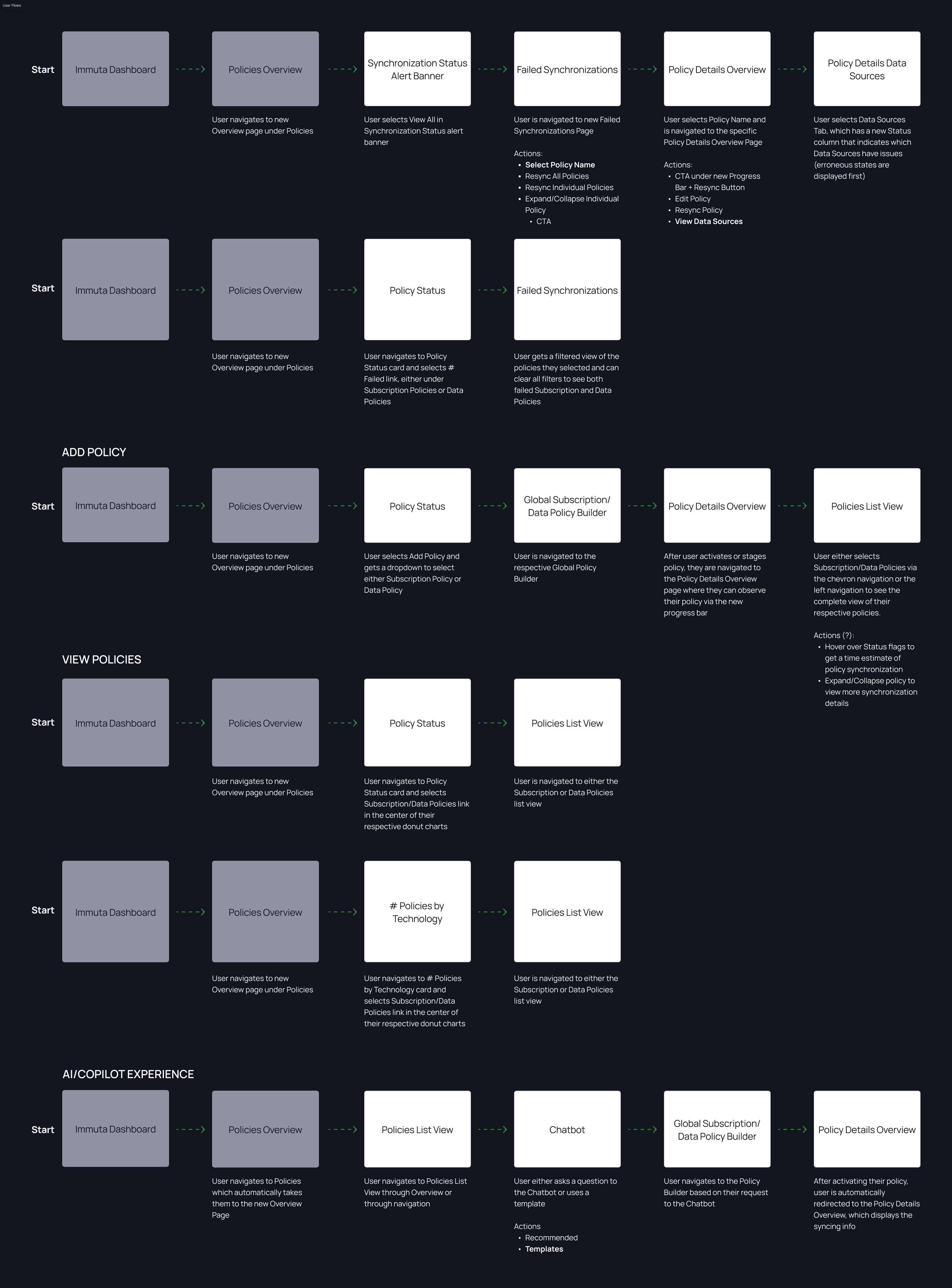
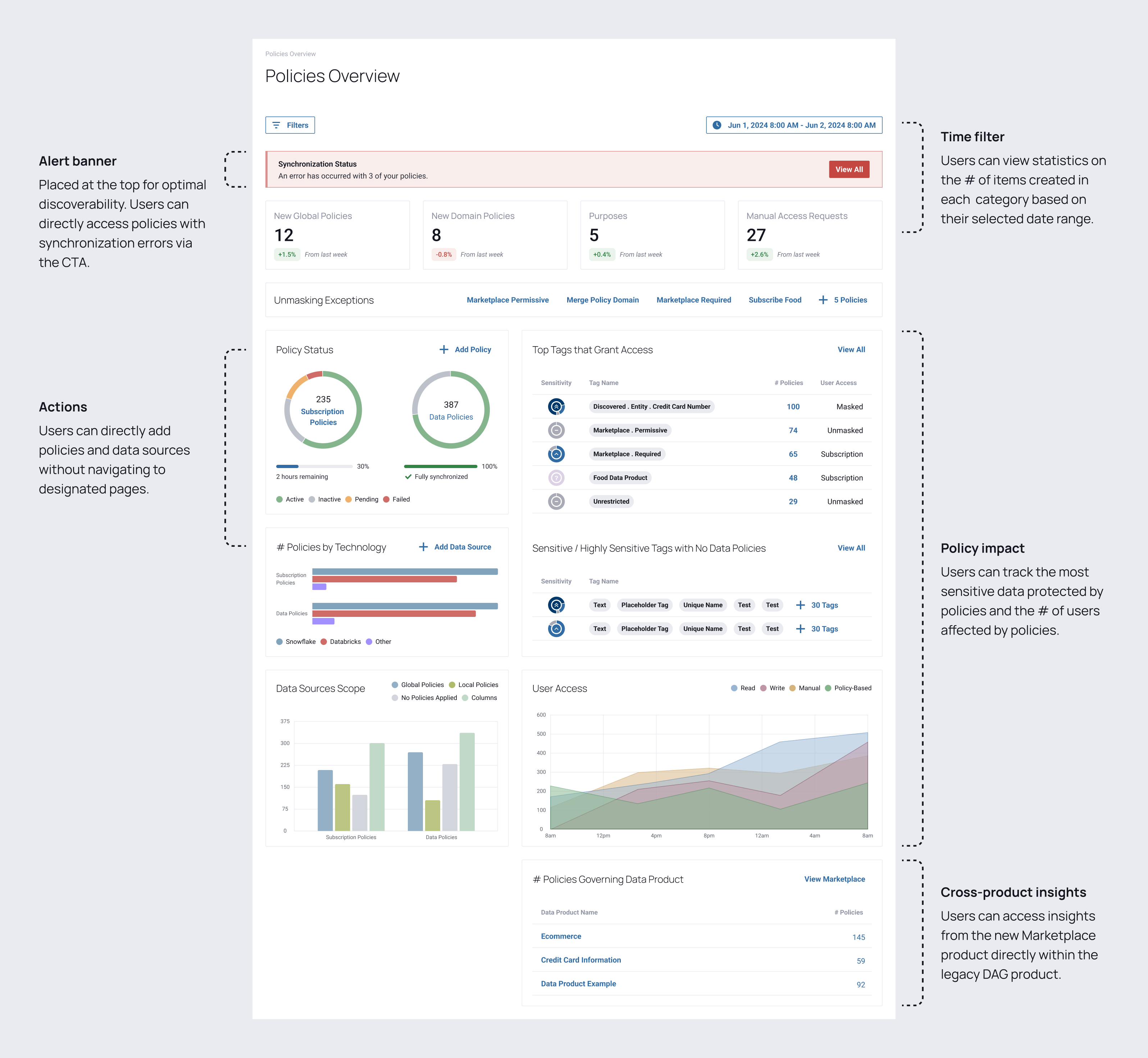
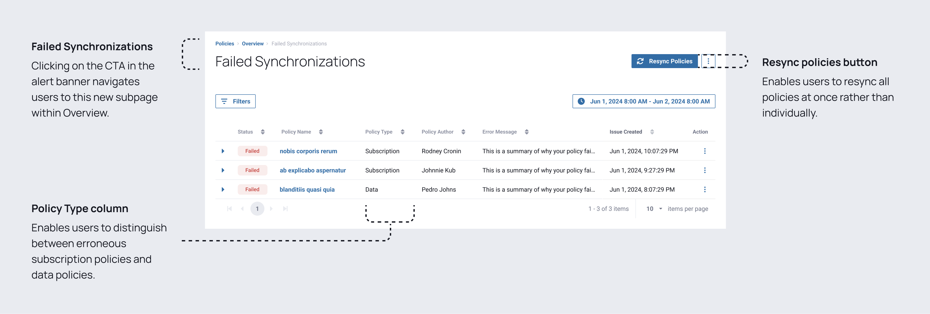
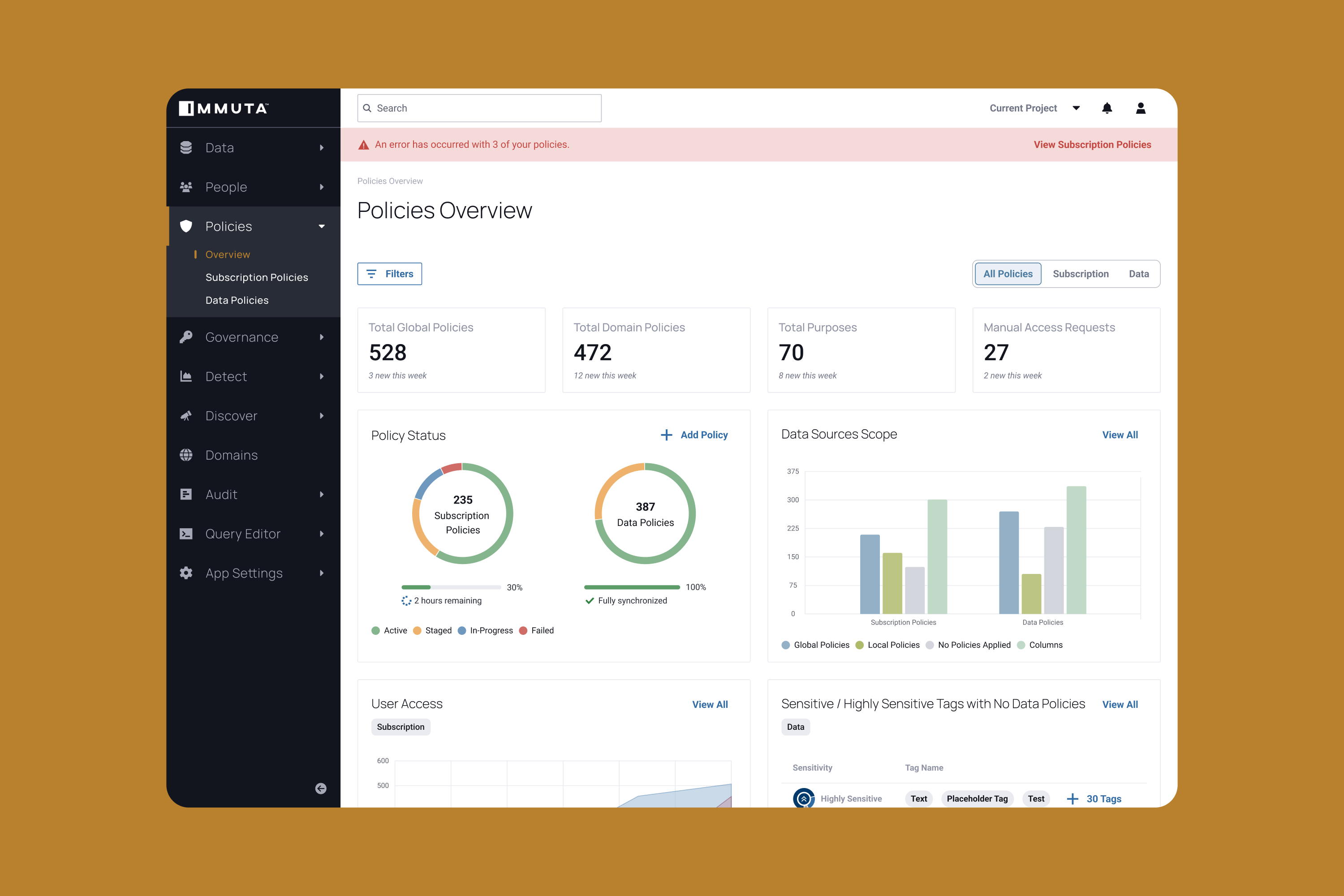
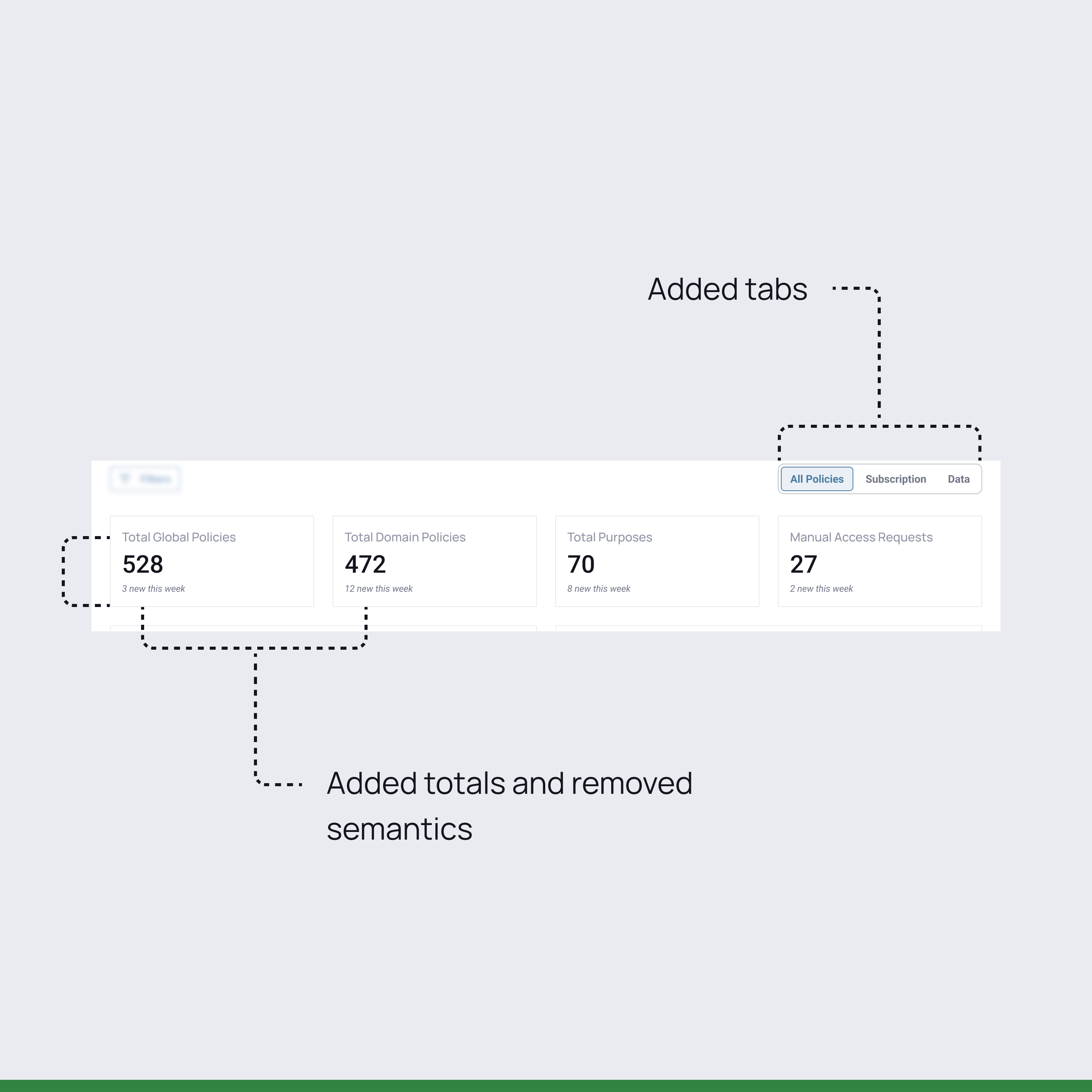
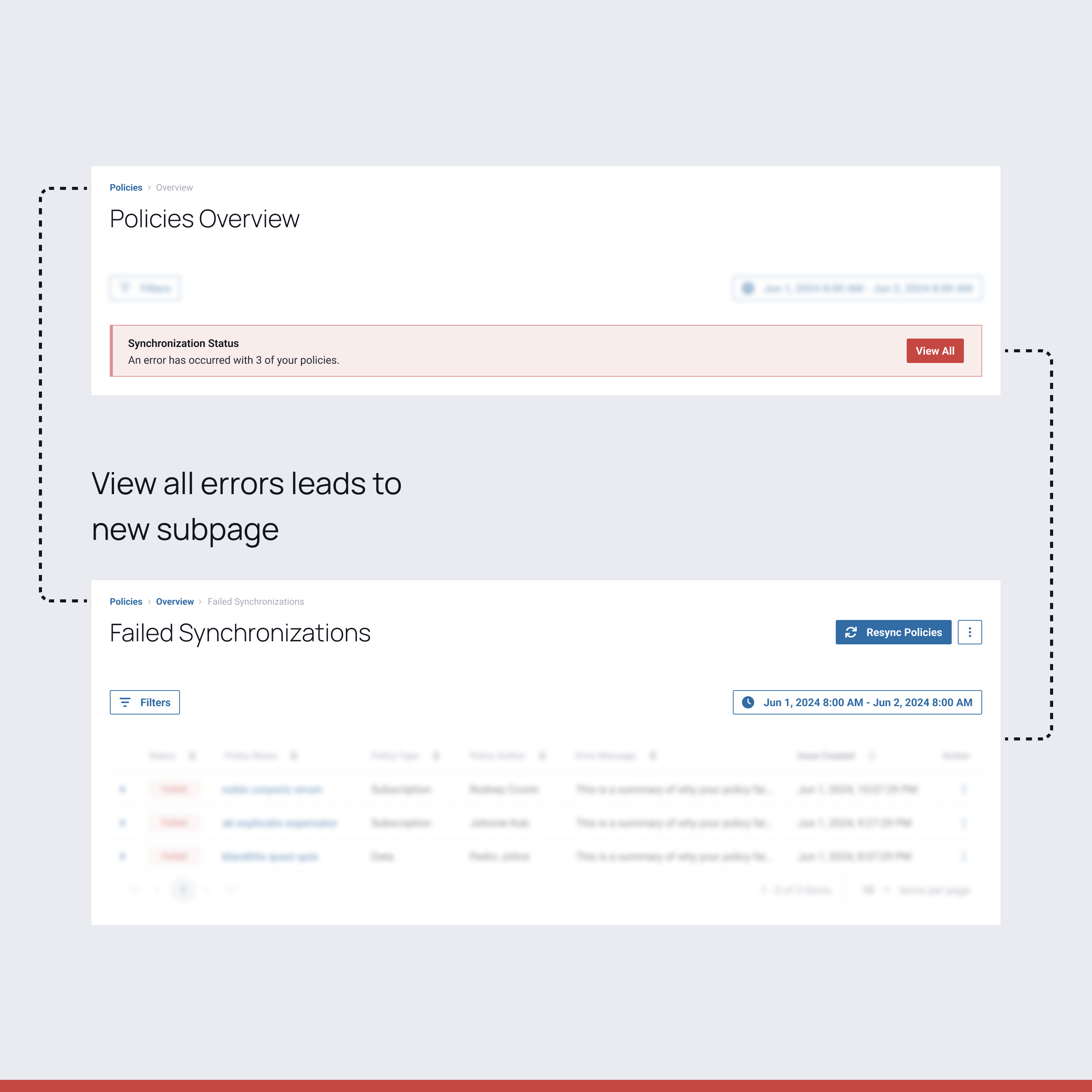
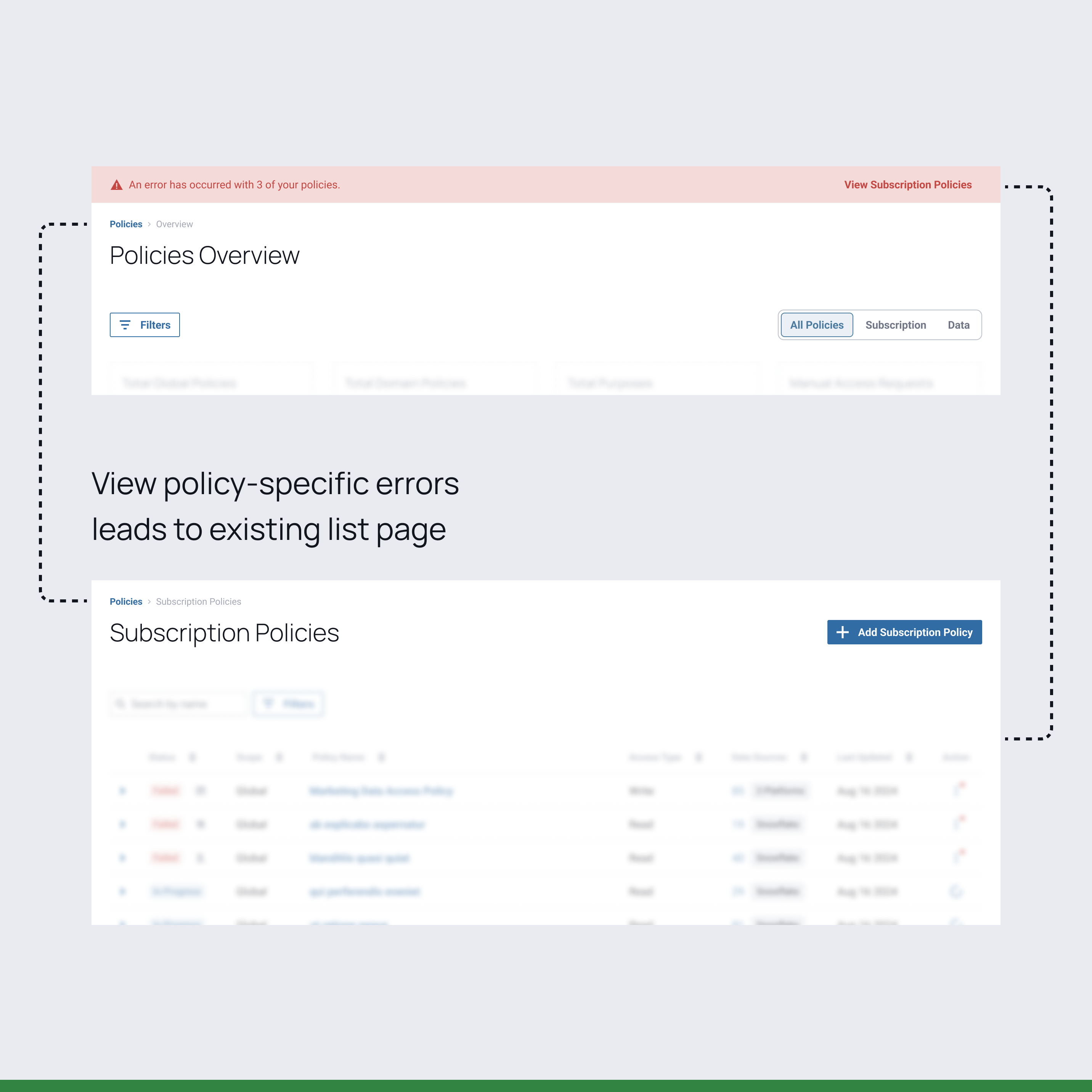
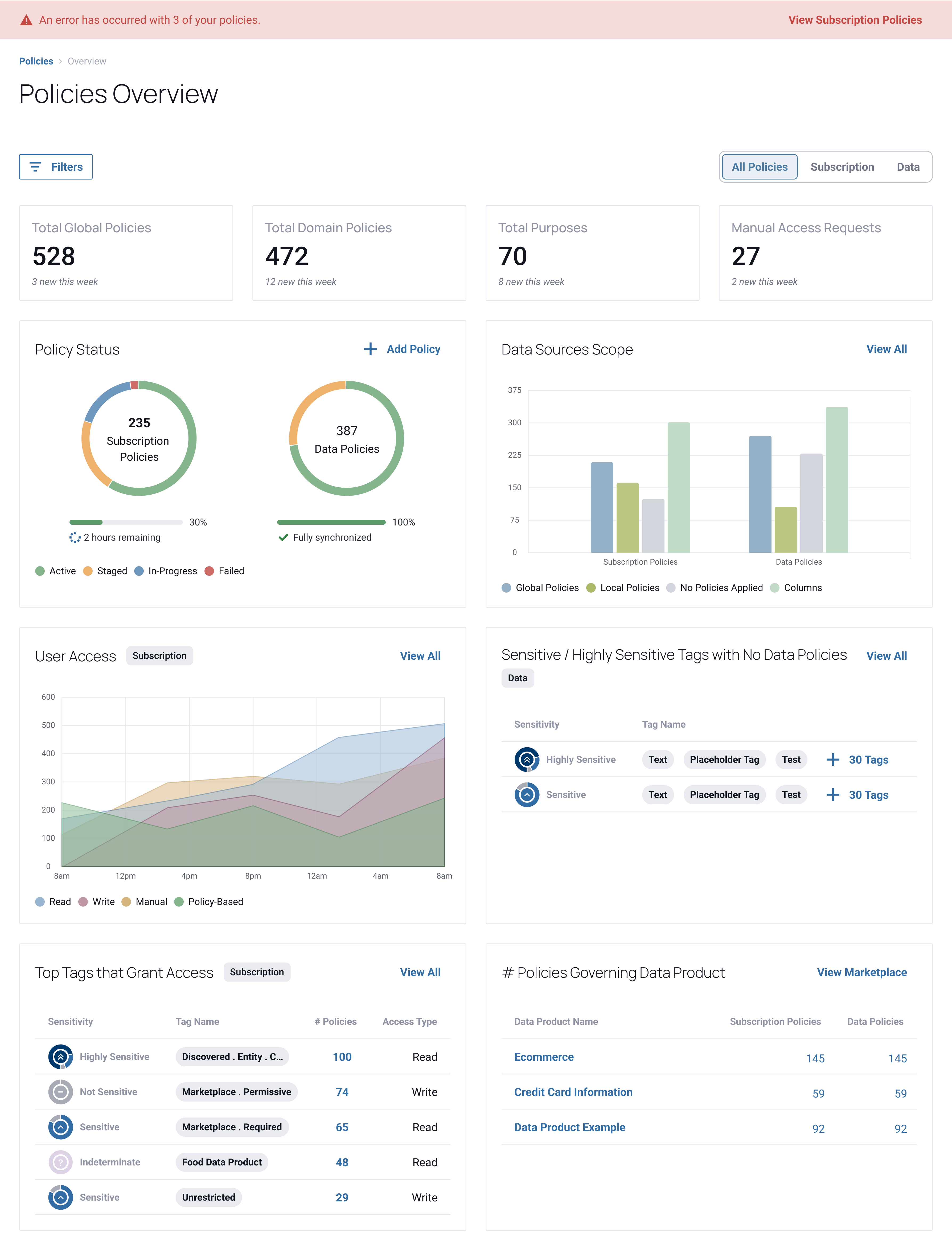
Creating a dashboard that enables users to track the synchronization status, scope, and impact of their policies for greater transparency and control.
ROLE
UX Design Intern
TIMELINE
June 2024–Aug 2024
6 weeks
TEAM
Peter Krueger / Manager
Kenlee Présumé / Sr. Designer
Claude Zwicker / Sr. PM
Claire Foster / Sr. PM
SKILLS
Product Design
Dashboard Design
Visual Design
TOOLS
Figma
Jira
OVERVIEW
Immuta is a data security and governance platform that offers automated access control, sensitive data discovery, data activity monitoring, and security and access control to businesses, government agencies, and healthcare organizations.
As the sole design intern in my summer cohort, I led and contributed to a total of 12 projects over the course of 11 weeks. These are the three larger projects I worked on:
Led design in 0→1 dashboard and improved existing policy pages to support real-time monitoring of policy synchronization and error tracking.
Developed notification strategies for users eligible for system updates and users approaching the end of support for their platform version.
Conceptualized and prototyped the long-term vision for Immuta’s first AI-powered feature designed to assist users in writing policies.
SOLUTION
A dashboard that allows organizations to measure the impact of their subscription and data policies and tracks sensitive columns that may require policy application to ensure data security.
CONTEXT
Immuta policies are rules that control access to data at local (tables) or global (tags) levels, based on data or user attributes.
Users can either create Subscription (who can access) or Data (how data is accessed and used) policies.
Synchronization only occurs when a users edits an active policy or creates and activates a new policy, triggering the process of applying that policy to new data sources.
PROBLEM
Currently, Immuta only has three statuses, including ACTIVE with a spinner icon to indicate policy synchronization.
Since there’s no clear indication of what’s happening in the background, so users are left uncertain about how long these processes should take and how to properly troubleshoot if issues arise.
With no proper communication of synchronization errors in the platform, users depend on Customer Success and Product teams to diagnose and manually fix issues.
OBJECTIVES
HMW statement
Fast, actionable insights for policy status and actions.
Intuitive triggers and status indicators.
Track progress with clear timelines.
Unified access information aligned with data platforms.
PROCESS
I started by creating a sitemap to better understand how the entire platform worked together and how various pages interacted with each other.
I explored options like notifications, toast messages, and adding tabs to the policy list, but they either didn’t work or were limited by other projects. Since many other navigation items had an overview, I decided to pursue this approach for Policies.
The new overview would ultimately provide centralization and offer more functionality beyond synchronization statuses, aligning with Immuta’s long-term vision for Policies.
Before diving into designing, I mapped out key user flows and clarified what specific actions users could take on each page.
I relied on input from my manager and referenced existing overview pages to determine what elements to include in the dashboard.
A key challenge was creating new graphs, moving away from the heavier Kendo UI graphs used in the current platform in favor of sleeker designs.
I received valuable feedback from the two PMs I was collaborating with, prompting me to restructure the error-tracing flow and make minor design adjustments.
Before
The banner didn’t quite blend with the rest of the page and took up too much vertical space.
After
I updated the banner placement and style and made the CTA policy-specific for transparency.
Before
PMs highlighted technical limitations with the time filter and emphasized using colors semantically, as green and red were misinterpreted to indicate positive and negative values.
After
I replaced the time filter with tabs to separate subscription and data policies and removed color semantics to display only the total quantity as a neutral value.
Before
PMs found the new failed synchronizations subpage confusing and adding unnecessary clicks, expecting to be led to an existing page.
After
The new distinction between subscription and data policies in the banner CTA now clearly directs the user to the existing specified policy list.
After several rounds of cross-functional reviews and 9 iterations, I ended up designing over 160 screens!
Clear statuses, utilizing both colors and existing platform iconography, allow users to fully understand their policy status.
When a user hovers over a failed status icon, more information is revealed to aid the user in troubleshooting.
LEARNINGS
I realized that focusing on high-fidelity designs without first understanding the user flows is counterproductive. It’s crucial to take a step back and think from a high-level perspective before diving into detailed designs. This approach helps prevent misalignment and ensures a more cohesive and effective user experience.
I also learned to consider how my work fits into the larger product ecosystem. As a result, I began to evaluate the broader impact of introducing new design patterns in my work and realized that my contributions were not isolated, but rather interconnected with the rest of the product.
It’s important not to get too attached to your designs. While they may look fine from a design perspective, they often require adjustments once reviewed by PMs and engineers, who provide additional insights about users, the product, and feasibility.
Thanks to the design team, I learned the importance of annotating designs and preparing detailed presentations for stakeholder meetings. This practice not only reduces confusion but also helps identify logical gaps in the work beforehand.
I discovered the value of regularly sharing my work with teammates and stakeholders, even while projects are ongoing. Keeping everyone updated helps align efforts and facilitates valuable feedback, contributing to a more cohesive and improved product.
A huge thank you to everyone who supported me this summer—especially Peter and the rest of the UX Design team including Kenlee, Karla, and Josh, my project collaborators, and those who made the 1.5-hour commute worthwhile ☻.